Top User Onboarding Best Practices to Boost Engagement

Your user's first click isn't just a sign-up. It's the make-or-break moment that decides if they become a loyal fan or a churn statistic. In today's market, a generic product tour is a guaranteed way to lose a customer you just paid to acquire. Users demand instant value, intuitive guidance, and an experience that feels built for them.
Nail your onboarding, and you'll skyrocket activation, boost retention, and build a growth engine. Flub it, and your acquisition budget becomes a leaky bucket, with users bailing before they see your product's magic. Success hinges on the strategic choices you make in those first few minutes.
This guide cuts through the noise. We're delivering eight actionable user onboarding best practices you can implement now. Forget vague theories. We'll dive into field-tested strategies that turn confused newcomers into engaged super-users. Learn to master everything from progressive disclosure and personalized paths to interactive tours that get results. Let's build an onboarding flow that doesn't just welcome users—it activates them and makes them stick around.
1. Progressive Disclosure
Progressive disclosure is simple: don't show everything at once. Instead of overwhelming new users with every feature, reveal functionality in stages. This is a core user onboarding best practice because it respects a user's cognitive limits, guiding them from zero to hero without the headache.
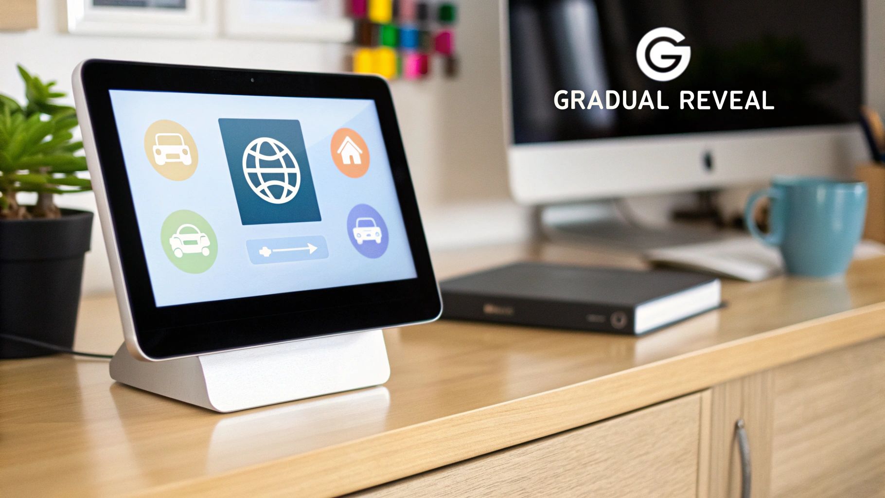
The principle is direct: show only what's necessary right now. This transforms a potential info-dump into a manageable, step-by-step experience. You slash initial friction and help users hit their first "Aha!" moment faster, massively improving their odds of sticking around.
Why It Works
This method aligns with how people actually learn. A new user's goal is to grasp your product's core value. Hitting them with every setting and option is like handing a student pilot a 747 flight manual on day one. It's too much, too soon.
Progressive disclosure builds confidence. Each small, successful interaction makes the user feel competent and in control. This gradual reveal turns the complex process of learning a new tool into a series of small, achievable wins.
How to Implement It
Map the User Journey: Chart the ideal path a new user must take to get activated. Pinpoint the absolute essential actions they need to perform to see value. This is your onboarding foundation.
Prioritize Core Features: Focus the initial experience on the one or two features that deliver your core promise. For Todoist, it's creating a task. Advanced features like recurring dates can wait.
Use Action Triggers: Reveal new features based on user actions, not time. Once a user creates three projects, introduce project templates. This keeps the information relevant and timely.
Offer an "Opt-Out": Not all users are beginners. Always provide a clear "Skip Tour" or "Go to Advanced Settings" link. It respects their time and expertise.
2. Interactive Product Tours
Interactive product tours are guided, hands-on walkthroughs where users learn by doing. Forget passive videos. These tours overlay instructions onto your live product, prompting users to click, type, and navigate through core features in real-time. This "learn by doing" model is one of the most effective user onboarding best practices because it closes the gap between seeing and understanding, fast-tracking proficiency.
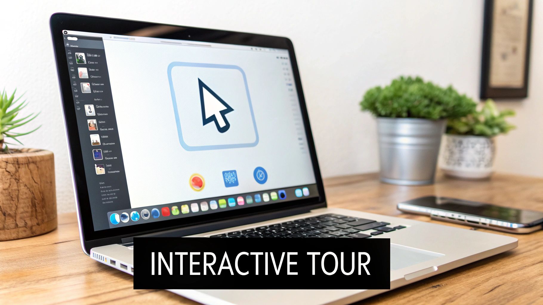
The goal is to make users perform key actions themselves, creating accomplishment and muscle memory. By engaging with actual UI elements, users don't just learn about your product; they learn how to use it. Canva nails this by having new users drag-and-drop elements and change text, letting them create a design within moments of signing up.
Why It Works
This method is powerful because it's active. People retain information better when they physically perform an action. An interactive tour turns onboarding from a lecture into a workshop, making the lessons stick. It helps users build momentum and achieve a quick win.
Instead of just telling a user that Slack has channels, a tour guides them to create one, name it, and invite a teammate. This immediate, tangible outcome demonstrates the product's value instantly.
How to Implement It
Focus on the "Golden Path": Identify the 3-5 critical actions a user must take to experience your product's core value. Your tour must guide them through this exact sequence—and nothing more.
Keep It Short and Sweet: Every step must have a clear purpose that moves the user closer to an "Aha!" moment. Don't point out trivial UI. The tour should be completable in under two minutes.
Provide Clear Exit Points: Users should feel in control, not trapped. Ensure a visible "Skip Tour" or "Exit" option is always available.
Use Action-Driven Triggers: Design the tour to advance only when the user completes an action. This confirmation loop reinforces learning and ensures they are actually following along, not just clicking "Next."
3. Personalized Onboarding Paths
Personalized onboarding scraps the one-size-fits-all model. Instead, it tailors the initial experience based on a user's role, goals, or needs. This strategy accepts that a marketer, a developer, and a project manager will use your product differently. By asking users their intentions upfront, you can guide them down a path that's immediately relevant, dramatically increasing engagement.
The core idea is relevance. A custom journey makes users feel understood and shows your product's value in their specific context from the start. Instead of making them sift through irrelevant features, you serve up the exact tools they need, accelerating their time-to-value and making your product feel like it was built just for them.
Why It Works
This technique directly answers the user's question: "What's in it for me?" A generic tour shows what a product can do, but a personalized path shows what it can do for them. This shift is crucial for preventing early churn.
By segmenting users at the start, you create a more efficient learning experience. Notion doesn't give every user a blank page. It asks what they'll use it for ("for my team," "for school") and suggests relevant templates. This immediate utility is a killer user onboarding best practice for converting signups into active users.
How to Implement It
Identify Key User Segments: Define your 2-3 most common user personas. What are their distinct goals? For a project management tool, this might be "Solo Freelancer," "Small Agency," or "Enterprise Team."
Use a Welcome Screen Survey: Just ask. Use a brief, one-question survey at sign-up to let users self-segment. For instance, "What's your primary role?" or "What do you want to achieve today?"
Tailor the First Experience: Based on their answer, customize what comes next. Show them relevant features, pre-populate their workspace with useful templates, or trigger a specific tutorial. Salesforce does this by setting up different dashboards for sales, service, or marketing roles.
Gather Feedback to Refine: Personalization isn't set-it-and-forget-it. Continuously collect feedback to ensure your segments are accurate and the tailored paths are helpful. Use analytics to see which paths lead to the highest activation.
4. Quick Wins and Early Value Delivery
A quick win is about engineering a user’s first session to provide an immediate, tangible benefit. This user onboarding best practice shifts the focus from teaching features to delivering a meaningful outcome, fast. The goal is to close the gap between a user's expectation of value and their actual experience of it, creating a powerful "Aha!" moment within minutes of signing up.

This strategy hinges on one insight: users sign up to solve a problem, not to learn your software. By helping them achieve a small victory right away, you prove your product's worth and build the momentum needed for deeper engagement. Calendly does this perfectly by letting a user set up and share their booking link in under two minutes, delivering core value almost instantly.
Why It Works
Modern users have zero patience. If they don't see value immediately, they'll churn. A quick win provides instant gratification and validates their decision to sign up. This initial success creates a positive emotional connection to your product.
Each quick win is a motivational stepping stone. It builds user confidence and shifts their mindset from "this is a complex tool I need to learn" to "this is a powerful tool that helps me." This positive feedback loop is essential for converting sign-ups into long-term users.
How to Implement It
Identify the "Aha!" Moment: Pinpoint the earliest possible moment a user experiences your product's core benefit. For Grammarly, it’s seeing the first text correction. What's the equivalent for your product?
Eliminate All Friction: Scrutinize your sign-up process. Remove every field, step, or click that isn't absolutely essential for delivering that first quick win. If a step doesn't contribute to the initial value moment, delay it.
Celebrate the Win: When the user achieves that first outcome, celebrate it. Use celebratory animations, checkmarks, or a simple "Congratulations!" message. This reinforces the feeling of accomplishment. Highlighting these wins can significantly improve activation metrics. You can read more about how small changes impact business by exploring conversion rate optimization tips.
Measure Time-to-Value: Track how long it takes a new user to reach their first "Aha!" moment. Constantly experiment to shorten this critical metric. The faster you deliver value, the higher your retention will be.
5. Social Proof Integration
Social proof integration means embedding testimonials, user counts, and success stories directly into your onboarding flow. It leverages the psychological principle that people look to others to guide their own behavior, especially when uncertain. This makes it a powerful user onboarding best practice for building instant trust and demonstrating value.
The principle is simple: reassure new users they've made the right choice. By showing that others—especially people or companies they admire—are succeeding with your product, you crush skepticism and boost their motivation to finish the setup. This transforms onboarding from a dry instructional flow into a persuasive and encouraging journey.
Why It Works
This technique taps into our fundamental need for validation. A new sign-up is a risk. Social proof de-risks the decision, calming anxieties and reinforcing their choice. It answers the subconscious question, "Are people like me using this and succeeding?"
Seeing success stories or recognizable logos makes your product's promised value feel tangible and achievable. When Slack shows that other teams in your industry are active users, it instantly frames the product as a standard tool for success. This validation encourages deeper engagement from day one.
How to Implement It
Showcase Peer Success Early: During sign-up, display logos of well-known companies or metrics like "Join 250,000+ businesses growing with us." This builds confidence from the start.
Segment Your Social Proof: Tailor the proof. If a user is from a marketing agency, show them testimonials from other marketers. Contextual relevance makes the validation exponentially more powerful.
Use Quantifiable Data: Vague claims are weak. Use specific, data-backed stats like, "Users report a 35% increase in productivity within their first month." Shopify excels at this by highlighting merchant revenue milestones.
Integrate Testimonials at Key Decision Points: Place a compelling quote just before a user needs to complete a critical action, like connecting their calendar or inviting a teammate. This can provide the final nudge they need to commit.
6. Progress Indicators and Gamification
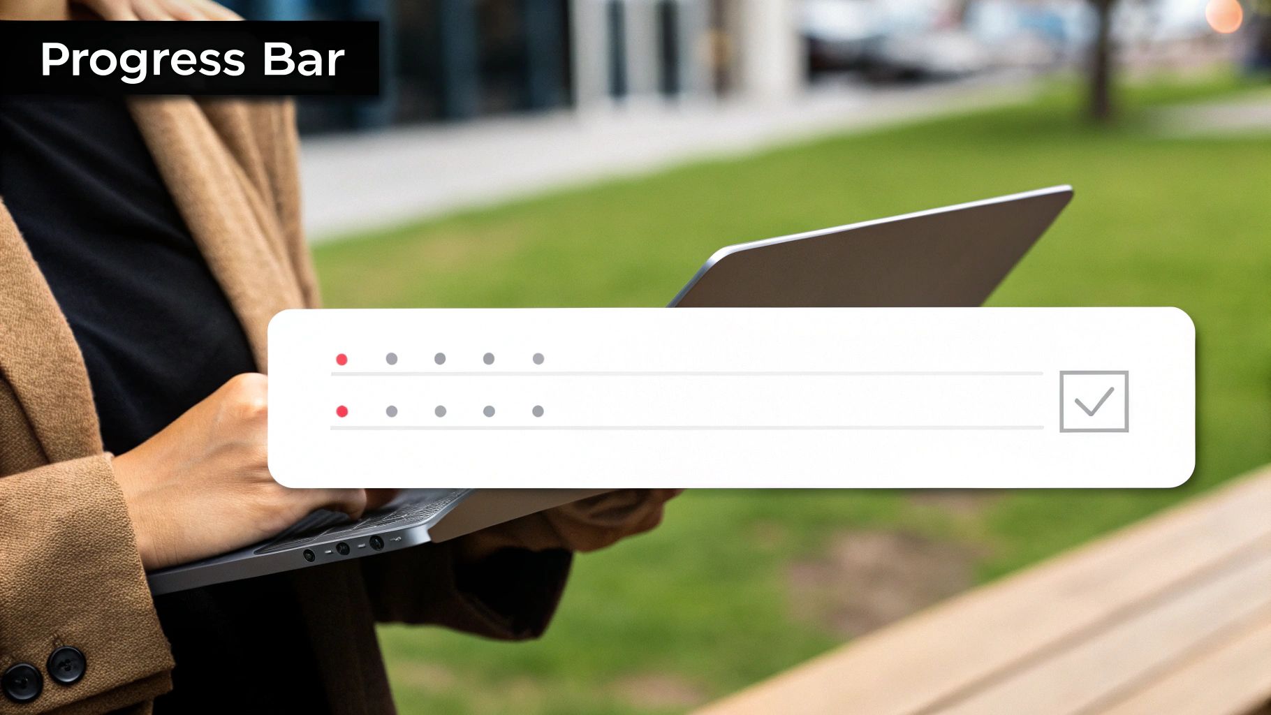
Progress indicators and gamification are psychological tools that turn onboarding from a chore into an engaging journey. This approach uses visual cues like checklists and completion bars to show users how far they've come, while game-like mechanics such as points and badges motivate them to keep going. It's a key user onboarding best practice because it taps into our desire for achievement and reward.
The principle is to make progress visible and satisfying. When users see a clear path forward and get rewarded for taking steps along it, they feel a sense of momentum. This method reduces the perceived effort of setup tasks and encourages users to explore the product more deeply.
Why It Works
This technique leverages the Zeigarnik effect—the psychological tendency to remember uncompleted tasks better than completed ones. A progress bar that’s 75% full creates a mental itch that users want to scratch. Gamification adds another layer by triggering dopamine when a user earns a badge, reinforcing positive behavior.
LinkedIn’s profile completion meter is a classic example. It doesn't just show a percentage; it gives clear, actionable suggestions to improve the score, turning a mundane task into a goal-oriented game. Similarly, Duolingo's streak counters make language learning feel like a compelling challenge, driving daily engagement.
How to Implement It
Visualize the Path: For any multi-step process, use a clear progress indicator. A simple checklist or a percentage bar visually answers the user’s questions: "Where am I?" and "How much is left?"
Celebrate Micro-Achievements: Don't wait until the end to provide positive feedback. When a user connects their calendar, celebrate it with a pop-up, a rewarding sound, or a new badge. This maintains momentum.
Make Rewards Relevant: Tie gamified elements to actions that help the user discover value. Don't award points for random clicks. Reward them for key activation tasks, like creating their first project.
Offer an Opt-Out: Gamification isn't for everyone. Some users find it distracting. Always provide an easy way to dismiss or skip these elements to respect their workflow.
7. Contextual Help and Just-in-Time Learning
Contextual help is a proactive support strategy that delivers assistance exactly when and where users need it. Instead of forcing users to hunt through a knowledge base, this just-in-time approach provides tips based on their current actions or signs of confusion. This is a top user onboarding best practice because it makes learning feel natural and integrated, not disruptive.
The principle is to anticipate user needs and offer help at the moment of friction. This transforms support from a reactive chore into a seamless part of the user experience. By delivering guidance in context, you reduce the cognitive load of learning your tool, helping users overcome hurdles without ever leaving the task at hand.
Why It Works
This method mirrors how people learn best: by doing. When a user is trying to figure out a complex formula, the most useful guidance is a tooltip that appears right in the formula bar, not a generic video tutorial they have to search for. This just-in-time learning makes knowledge stick.
Contextual help slashes frustration and prevents users from abandoning your product when they get stuck. For example, Notion's slash command menu appears as you type, offering a list of possible actions. This small intervention turns a moment of confusion into an opportunity for mastery, building user confidence with every interaction.
How to Implement It
Identify Friction Points: Use analytics and session recordings to pinpoint where users hesitate, make errors, or drop off. These are prime locations for targeted help. Users struggling with an integration? A tooltip should appear there.
Use a Variety of Formats: Contextual help isn't just tooltips. Use inline hints (like Gmail's smart compose), interactive guides, or small, non-intrusive pop-ups. Figma provides short explanations when you hover over unfamiliar icons.
Make Help Easily Dismissible: Great contextual help is unobtrusive. Users must be able to ignore or close it with a single click. Assistance should never feel like a roadblock.
Integrate Smarter Support Systems: For complex issues, use modern tech to provide instant, tailored answers. For advanced insights on this, consider AI's Role in Empowering Customer Support, which can offer personalized assistance during the onboarding journey.
8. Multi-Channel Onboarding Orchestration
Multi-channel onboarding orchestration means coordinating a user's initial experience across multiple touchpoints—email, in-app messages, SMS, and video tutorials. Instead of treating each channel as a silo, this holistic approach weaves them into a single, cohesive journey. This is a crucial user onboarding best practice because it meets users where they are, reinforcing key messages and providing timely support through their preferred channels.
The goal is to create a seamless, supportive environment that guides users toward activation, whether they're in your app or checking their inbox. An in-app prompt might introduce a feature, while a follow-up email provides a video tutorial on how to master it. This synchronized communication ensures the user never feels lost.
Why It Works
A user's journey doesn't stop at your product's login screen. They interact with your brand everywhere, and a disjointed experience causes friction. Orchestrating these touchpoints creates a powerful, reinforcing loop that deepens engagement and accelerates learning.
This method also recognizes that different messages fit different channels. An urgent notification is best as an SMS, while a deeper educational piece is perfect for an email. By delivering the right message through the right channel at the right time, you respect the user's attention and maximize your impact.
How to Implement It
Map the Cross-Channel Journey: Before sending anything, map the entire user journey and identify key activation milestones. For each milestone, decide which channel is most effective for communicating the next step. Use in-app tooltips for initial discovery and an email sequence for long-term goal setting.
Maintain Consistent Branding and Tone: Your brand's voice and visual identity must be consistent everywhere. A user should instantly recognize your communication, whether it's an email from Mailchimp or an in-app guide. Consistency builds trust.
Centralize User Data: To orchestrate channels effectively, you need a single source of truth for user behavior. Use a customer data platform (CDP) or marketing automation tool to track interactions across your app, website, and email. For smaller teams, you can learn more about marketing automation for small businesses here.
Let Users Control Their Preferences: Not everyone wants daily emails or SMS alerts. Provide a clear way for users to manage their communication preferences. Respecting their choices prevents notification fatigue.
User Onboarding Best Practices Comparison
Onboarding Method | Implementation Complexity 🔄 | Resource Requirements ⚡ | Expected Outcomes 📊 | Ideal Use Cases 💡 | Key Advantages ⭐ |
|---|---|---|---|---|---|
Progressive Disclosure | Medium - requires careful info hierarchy planning and pacing | Moderate - designing layered steps and analytics | Reduced cognitive load, higher completion rates, gradual feature adoption | Products with complex features needing user-paced learning | Reduces overwhelm, improves completion, scalable learning |
Interactive Product Tours | High - needs coordination of design, dev, and ongoing maintenance | High - overlay tech, cross-device testing | Hands-on learning, quick retention, immediate value demonstration | Products benefiting from real-time guided interaction | Hands-on experience, reduces learning gap, interactive |
Personalized Onboarding Paths | Very High - requires robust data, dynamic adaptation | Very High - segmentation, testing, data pipelines | Higher engagement, better conversion, tailored time-to-value | Complex products with distinct user segments | Highly relevant onboarding, improves satisfaction |
Quick Wins and Early Value Delivery | Low to Medium - identifying key actions early | Low to Moderate - requires deep user insight | Builds confidence fast, increases early engagement, reduces churn | Products with clear quick wins or fast value moments | Immediate impact, boosts motivation, reduces early drop-off |
Social Proof Integration | Low to Medium - needs content updates and strategic placement | Moderate - gathering and updating testimonials | Builds trust, reduces hesitation, increases conversion | Onboarding to build trust or validate value | Builds credibility fast, motivates via peer influence |
Progress Indicators and Gamification | Medium - designing visual and game mechanics | Moderate - UI elements, reward systems | Increased completion, engagement, motivation, reduces abandonment | Longer onboarding processes needing engagement | Motivates users, clear progress, fun engagement |
Contextual Help and Just-in-Time Learning | High - requires intelligent trigger mechanisms | High - ongoing content and behavior tracking | Efficient learning, reduced cognitive load, user independence | Complex tools needing on-demand assistance | Timely help delivers focused support, reduces overwhelm |
Multi-Channel Onboarding Orchestration | Very High - syncing multiple channels and tracking | Very High - content creation, automation, analytics | Consistent engagement, increased completion, flexible consumption | Enterprises requiring unified multi-touch onboarding | Reach through preferred channels, reinforce learning |
Stop Welcoming, Start Winning: Your Next Move
We’ve covered the modern roadmap of user onboarding best practices, moving far beyond a simple "welcome" email. The old model of front-loading information is dead. Success today isn't about teaching users everything your product can do; it’s about guiding them to what they need it to do, as quickly as possible.
From the clean design of progressive disclosure to the instant gratification of quick wins, each strategy serves one purpose: to turn initial curiosity into lasting engagement. You’ve seen how interactive tours demolish passive learning, how personalized paths make users feel understood, and how gamification can turn setup into a challenge. These aren't just features; they're the core mechanics of a growth engine powered by user success.
From Theory to Tangible Growth
Mastering these concepts directly impacts your most critical metrics. A well-orchestrated onboarding flow doesn't just reduce churn; it builds advocates. It doesn't just improve activation; it shortens the time-to-value, proving your product's worth in minutes, not weeks.
The key takeaway is this: Onboarding is not a one-time event, but an ongoing conversation. It starts the moment a user signs up and continues with every contextual tip, progress bar, and celebratory pop-up. By implementing these user onboarding best practices, you engineer an experience that constantly reinforces their decision to choose you.
Your Action Plan for Immediate Impact
Overwhelmed? Don't be. Start small, measure, and iterate. You don't need to implement all eight strategies at once. Get started today:
Identify Your 'Aha!' Moment: What single action makes a new user think, "Wow, this is exactly what I needed"? Focus your entire initial onboarding on getting them there, friction-free. This is your North Star.
Pick One Bottleneck: Use analytics to find where most users drop off. Is it a complex form? A confusing feature? Target that point first. Could a contextual tooltip or a simplified UI fix it?
Implement One Strategy: Choose the single best practice from this list that solves your biggest problem. If users are overwhelmed, try progressive disclosure. If they seem unmotivated, add a progress indicator.
This iterative approach is perfect for bootstrapped founders and lean teams. For a deeper dive, explore more proven customer onboarding best practices to find more tactical ideas. The goal isn't perfection; it's momentum. Make one meaningful change this week, measure the results, and build from there. Your future loyal customers will thank you.
Ready to turn these best practices into an automated growth machine? At Viral Marketing Lab, we provide bootstrapped founders with the actionable playbooks and AI-powered tools needed to build and optimize high-converting user onboarding flows without the enterprise budget. Explore our resources and start building a better onboarding experience today.


